
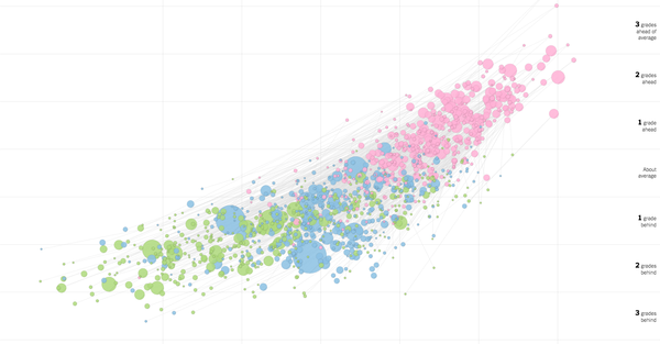
200 million tests aren’t wrong. And its making my head hurt. The NY times released an amazing set of interactive graphs this week showing correlations between NAEP tests—the so called nation’s scorecard—and family income and race. The results are incredibly discouraging, and really the more you look at it the more your head will hurt.…
segregation
Housing should not be Destiny- Reforming Enrollment Rules to Increase Equity
Low income students in Oakland are 18.3 times more likely to be in lowest scoring schools in reading than their more advantaged peers. That was one of the most striking results in the recent CRPE study. And while that was the most jarring stat, putting Oakland in dead last among the 50 cities studies, every…