How is your local school doing? Last week, the state of California presented its answer in a new, color-coded dashboard, reflecting a range of academic and school culture measures. This was a 180-degree turn from the old measure, the Academic Performance Index (API), which boiled school performance down to a single number. While the API was easy to understand, it made complex issues too simple.
But did the pendulum swing too far in the other direction?
Early Reviews Not Good
So how is the new system? Not great, according to most of the commentary I have seen.
To some, the methodology is off and not particularly helpful in providing useful transparent school quality information. The East Bay Times captured many of these critiques in its piece, New State Education Portal Hides School Disparities:
Unfortunately, while state education officials deserve a B for effort, their execution was a D. Through illogical data manipulation, their presentation hides differences between districts and schools, and between student groups based on ethnicity and income…
For example, a school at the very top in math scores that had recently been slipping receives the same yellow ranking as a school at the bottom that has seen some improvement.
We all want to recognize improvements. But let’s not kid ourselves. No matter the trajectory of their change, schools at the top and bottom ends of test scores are not the same. Pretending they are hides the differences between schools and between students within those schools based on ethnicity and income. It renders the data meaningless and provides an excuse for struggling schools to ignore the seriousness of their plights.
Beyond how they came up with the ratings, there are constant questions on the usefulness of dashboards for families.
Parent Revolution has led that charge, as detailed in a recent L.A. Times article:
Chief Executive Seth Litt said Parent Revolution showed parents the dashboard as it looks now. “They kept asking us what the API scores were, even though they weren’t current scores,” he said. He added that the layout makes it hard to compare specific factors in one school to those in another.
Alexandra Menjivar, who has children at Wadsworth Elementary in South L.A., traveled on Parent Revolution’s overnight bus. She told the board that the new ratings system “doesn’t give me a starting point for how my school is doing overall. Parents cannot be partners in their kids’ education if the state keeps parents in the dark.”
Others, however, have indicated that the dashboard can be useful when parents are given some support in understanding the data. From the same Times article:
The California Parent Teacher Assn. said it got a different reaction in focus groups it held for parents. “Most of the feedback was ‘I thought it was much more complicated than this. Now I understand it,’” said Celia Jaffe, the group’s vice president for education.
Layered on top of this is Oakland’s participation in its own school performance framework as part of its work with several other large districts in California, the CORE Districts.
So let’s actually take a look.
Putting the Dashboard to the Test
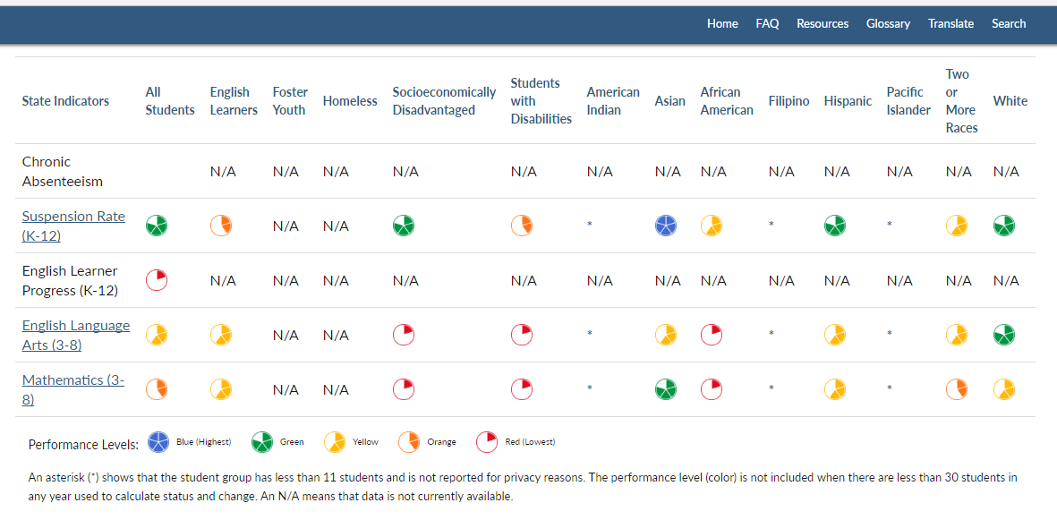
Here is the “student and group report” for Montera on the State’s dashboard:
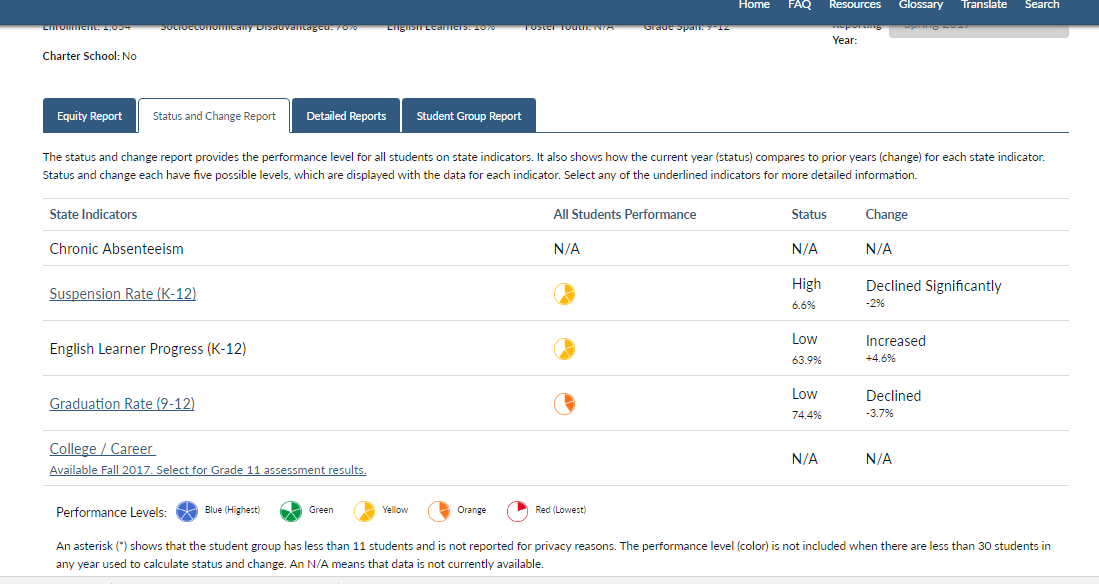
And here is the “status and change report” for Skyline, again from the state:
I don’t know about you, but I don’t find it particularly easy to compare these two examples, except perhaps if I print out the reports. Fortunately, Ed Source has created some tools to help with comparisons. And Parent Revolution has worked to boil the complexity into some more digestible numbers. And I expect we will get better at understanding the dashboards over time as some authors suggest.
And since Oakland has its own school performance framework, let’s take a look at how that system represents the same schools.
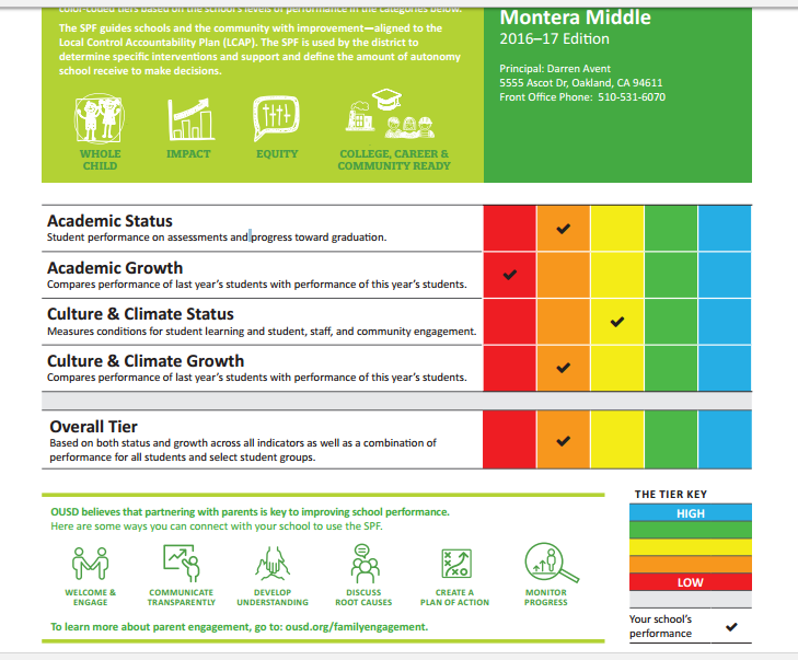
Here is Montera on a summary page:
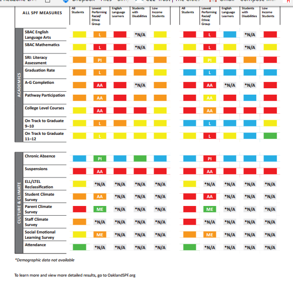
And again a look at Skyline, showing the page with greater detail:
Why This Matters
Knowing how schools are doing matters. It should help guide parent decision-making and it should help us in knowing where we need to provide support. It’s not as simple as a single number to judge schools (like the API). But it also should not be that complicated.
Here’s to coming together amidst the ideological battles to keep working with this rich set of data, and analyzing and presenting it so that it is actionable for schools, families and districts. The stakes couldn’t be higher for under-served families.


