200 million tests aren’t wrong. And its making my head hurt.
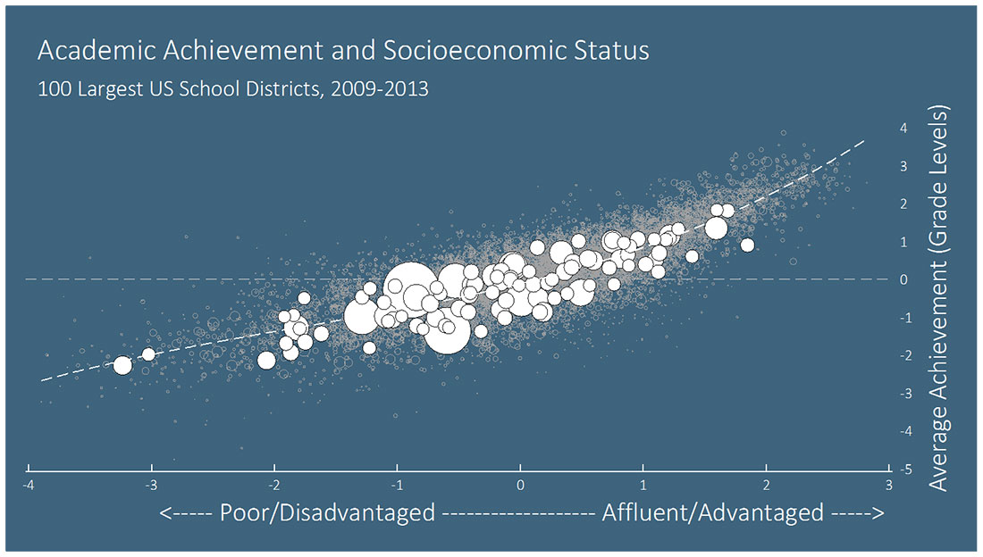
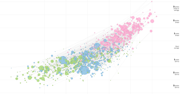
The NY times released an amazing set of interactive graphs this week showing correlations between NAEP tests—the so called nation’s scorecard—and family income and race. The results are incredibly discouraging, and really the more you look at it the more your head will hurt.
I am stage 1 migraine as I look at the income correlations, there are a few outliers, but basically everywhere, income determines or is very highly correlated with achievement, and poor kids are significantly behind. There definitely are districts that outperform the averages, and we need to dig deeper here. I know from experience that some schools break this pattern and certainly individual students beat these odds. But there is a depressing persistence found in the report the Times article was based on.

Basically, that sloped dotted line shows how closely related advantage and achievement are, and the closer those dots (representing districts) track the line, the stronger the relationship—and you can see the relationship is very strong.
Head is starting to pound as I click through the next graph that covers race (Hispanic, Black and White). The achievement rates of each group are tied together in a tripod showing achievement of students of each race in any given district, but White students are always at the summit and Black and Hispanic ones make up the feet. There are hundreds of districts. I can’t find a single district where Black or Hispanic students outperform Whites, not even one where it’s close. Each one you click.
Los Angeles- Whites, plus 1 grade above, Hispanics, minus 1.7, Blacks, minus 2.
Syracuse- Whites, minus 1.6, Hispanics, minus 3.1, Blacks, minus 2.8.
San Francisco- Whites, plus 1.3, Hispanics, minus 2.0, Blacks, minus 2.5.
New York City- Whites, plus 1.3. Hispanics and Blacks minus 1 respectively
Couldn’t find Oakland, but every one you go through looks like that, there is not a single district I found where it is even close, not even close. There are no real outliers I found for racial achievement gaps.
Each one you click, one more confirmation, whether Blacks or Hispanics are further behind alternates, but never the leader. Even when incomes between the races are the same, or Whites earn less, their achievement is still higher.
I guess this should not surprise me, I am a Black man, I work in schools, I went to school, I saw the subtle and not subtle belief gaps in the system and the way a seeming neutral curriculum actually alienates people of color, and I see the vast disparities that exist between districts and even within them, and the historical legacies that disadvantage some and privilege others.
But it still bothers me, that there was not one outlier, not one district where achievement was even close. Maybe that says more about me, and that despite all the evidence around me to the contrary that I think a counter example must exist, that some locality should have broken the chains of racism and affirmatively addressed its legacy, but no.
I usually try to end on some profundity or humor, but right now my head just hurts.


Setting aside the whole standardized-test-results-as-proxy-for-“achievement” question (since if a test found that Black kids outperformed white kids, its validity would immediately be questioned- this is part of what makes a standardized test, standardized), the uniformity in this graph makes me feel that school choice in an economically diverse city like Oakland will inevitably exacerbate rather than improve inequity in outcomes. You don’t mention white and wealthy parents’ opportunity hoarding as a cause of disparities, but I think it is a very real thing (and I engage in it myself, despite some efforts to resist). It is at work in parents’ engagement with the whole enrollment process.