Oakland families should have received their offers for Round 2 of enrollment already, and most high-demand schools are full or filling up.
If you aren’t sure about your top choice, or if you just want to see what else is out there, we have a list of schools that you should take a look at.
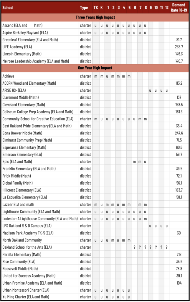
Thanks to the so-called CORE data, we have some stronger analyses of testing results that helps identify schools that have been making strong progress. Some of these schools still have openings, and there are some gems in here.
Award Winning Schools for Academic Growth
The CORE data looks at how much individual students grow from year to year and compares school growth to similar schools. Because it follows the same children and also adjusts for privilege, this measure more accurately describes the impact the schools are having. Below you can see the list of schools in Oakland that won awards and the likely availability of seats based on the school finder tool.
OUSD had not updated its enrollment data by the time I wrote this, so I am including the demand rates for OUSD schools from last year—which may provide some guidance on which schools might still have space. I will update this table when and if OUSD updates its data.
Greenleaf is the only school with less than a 100% demand rate that has made growth for 3 years. However, there were several schools both on the charter and district side that either had likely open seats or demand rates below 100%.
No statistic, not even student growth, can fully capture the quality of school, so it is up to families to visit, check the other statistics, and talk to other students and families.
All the enrollment resources for charter and district schools can be found here. And you can find a map to all the award winning schools and some more information about them on this blog from the Oakland CORE Data Collaborative. Please make the best choice for your child, and pass this on to other families who are still looking.
Key to understand this chart:
- U = Unlikely, the school probably does not have spots for the grade
- M = Maybe, the school had some spots for the grade, but they may have filled up
- Demand rate = The number of applicants who chose the school first compared to the number of open seats (a lower demand rate indicates that there are more likely to be open seats)